Since getting a 3D printer earlier this year, I have been hard at work printing structures and details for the new layout. One of the things I like is the ability to customize the items without a lot of effort. This allows me to both have something unique to my layout and fit the structure into the available space. Another benefit that I discovered is the speed and accuracy of the finished product. This has become important as I get older as I can't hold tools as long as I used to without getting finger cramps! Also, I can focus on the finish and details rather than some of the assembly, which means I can spend more time working on the layout itself.
The Starting Point...
I decided to modify this signal tower to fit better in a secondary interchange location. I printed and detailed the original 3-story tower and placed it at the entrance to the Western terminal of the layout. This structure is from KABrumble Designs and can be found on thingiverse. The 3-story version is appropriate for a large terminus but seemed overwhelming when placed at a small interchange with the SP&S. I needed something smaller, less imposing, yet keeping with a "family" appearance. I decided to modify the design to fit the available space and intended use.
The process I followed uses no CAD software and should work with any 3D printer, with all modifications made directly in the slicer software.
Making the Core Changes
The slicer allows you to merge all of the parts into a fully-assembled model. While this is not how it would be printed, it allows you to visualize the result and plan for your changes. I started by listing my requirements and the changes I would need to make:
- Eliminate the middle story to create a two-story tower. I would need to rotate the top story 90-degrees to align the door with the stairs.
- The platform at the top of the stairs would need to be rotated 90-degrees and the railings moved to the opposite end.
- The base would need to be reshaped to support the stair tower being rotated 90-degrees, and the front pad would need to be shortened to accommodate a single stairway.
- Flatten the roof somewhat, making the peak less pronounced.
- Determine if the 4 stair platform parts and the stairs with handrails could be printed as single parts. These were a bit fiddly to assemble when building the 3-story version.
With these goals established, I set upon loading the STL parts into the slicer, starting with the walls, the roof, and the front and side windows. I first selected the walls and used the Cut tool and selected the point between the second and third story, keeping both parts and their position. I next selected the bottom half, enabled the Cut tool and positioned the cut between the first and second story. This time, I unchecked the box for the upper floor so it would be deleted after the cut.
I now had the two stories as separate parts. I rotated the upper floor 90-degrees counter-clockwise and centered the part. Next, I centered the first floor and both objects consumed the same space. With both objects selected, I was able to merge them into a single part and then - selecting just the upper floor - raise it until it sat on top of the lower floor. I zoomed in to make sure that the parts overlapped by at least 0.02mm to make a good bond between the parts. 
To help visualize the finished modifications, I duplicated the new 2-story walls. Using the copy, I centered the walls over the foundation and then centered the roof over the walls. It helps to "look up from the bottom" to make sure that things are generally aligned. This step needs to be "close enough" so we can see the finished design. Once aligned, I merged the 3 parts together, raised the walls onto the foundation and the roof onto the walls. The original roof seemed to dominate the structure, so I selected that part and roughly scaled the vertical height until it looked pleasing to the eye - no calculation or math involved. Once l was satisfied with the design, I separated this into its core parts, deleting the walls. (remember, this was a copy of the customized walls!). I moved the roof onto the build plate along with the square for the floor. I set up separate plates in the slicer for the foundation, roof, and floor that would be printed in gray, another plate for the walls printed in white, and a third plate for the trim pieces, which will be printed in an olive green. The windows will incorporate a single layer of transparent filament to represent the glass. Of course, you can use clear plastic for the windows and print everything on a single plate in a single color to save time. I prefer to print in a color that will match the finished color when possible.
Modifying the Details
Since I had already built and assembled the 3-story version, I was familiar with some of the assembly challenges - most notably assembling the 4 frames of the platform support and adding the handrails to the stairs. I planned to print these parts with a 0.2mm nozzle so decided to merge and mesh-Boolean these parts in the slicer. I started by selecting each of the 4 frames and setting them on the top edge (upside down). Two of the frames were rotated 90-degrees and then the parts were aligned with a small amount of overlap. The four parts were merged into a single object, and then I applied the mesh-Boolean operation that permanently made them into a single part.
Next, I worked on the stairs. I turned the handrails on edge, moved them so they merged into the side stringer of the stairs and aligned the balusters with the stairs. Once in position, I selected the 3 parts and merged them into a single object. I also modified the platform, which was made up of the platform, balusters, and top rails. I was able to separate this part into its individual components. I moved the platform out of the way so I could select the end balusters and rail and drag them to the opposite end. I merged the balusters and 2 rails together, allowing me to select and then raise the handrails to the top of the balusters. The platform was then returned to the original position and merged with the remaining parts.
The foundation needed some minor modifications to the concrete pads that the stairs and platform frame set on. I used the cut tool and removed them flush with the foundation, retaining the cut parts. I moved the stair landing back into position and kept advancing the part into the foundation, leaving just enough for the stairs to sit on. I deleted the rear pad and created a new one, slightly larger than the footprint of the platform tower. I made sure to have enough extra space on the long side to blend back into the foundation. Before merging this part, I added 4 negative squares for the platform tower feet to fit into. Once I confirmed the alignment by superimposing the tower over the platform, I performed a mesh-Boolean operation to make the holes permanent. Then I merged the platform into the foundation.
I selected one of the corner trim pieces and set its length to the height of the walls, then made 3 copies of that part.
The last change that I made was to create a cube that was the exact size of the windows that was two layers thick, adding this to each window part. My layer height was set to 0.06mm so this "glass" panel thickness was set to 0.12mm. This is thick enough to be strong but not so thick that you can't see what's inside when illuminated. I plan on experimenting with "ironing" of these parts to minimize the lines in the top of the layer. This was done for each of the windows.
Printing
Printing was straightforward, although for the plate containing the window and trim parts, I slowed the print speed down about 30%. This helped to ensure that the complex parts of the platform tower and stair assembly printed correctly. This is how I laid out the plates for printing:

Printing at 0.2mm takes a while, but the results are worth it when creating a foreground model! Once the parts finished printing, I examined them, cleaned up any bits of stringing with a heat gun, and dry-fit the parts. Now it's on to painting and detailing.
Painting
This model will be placed fairly close to the foreground, so I decided to put some extra effort into the paint and detail that it would receive. All of the base paint was done with "rattle-can" paints from the local hardware store.
Walls
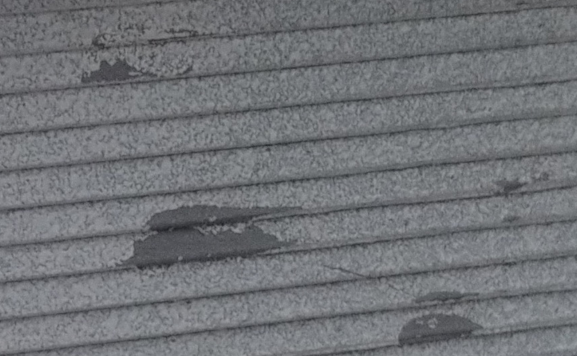 The walls were first painted with a color called "Driftwood", which was a warm gray-brown that resembled bare weathered wood. Once this was dry, I used an old brush to apply small blotches of rubber cement to random positions on each wall. I added some specifically to areas that might receive more moisture in real-life, like below windows and under the platform frame. I let this dry for about an hour before applying a topcoat of "Shell White". This is a chalky white color that looks like it's a bit faded. I let this dry overnight before rubbing the walls with a dry paper towel to remove the rubber cement. This gives a good effect of peeling paint, as shown in the closeup photo. I finished the walls by applying a light overspray of black chalk paint. This was done by placing the walls on a drop-cloth on the ground and spraying a spritz or two from arm height. This was repeated for each side and you can see that it gives an effect of old paint with algae spots. I model the Pacific Northwest, so lots of rain and shade promotes this effect.
Foundation
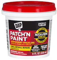 The foundation was prepped with red primer, which I like as a basic brick or red sandstone base. I then applied washes of white and light gray using Vallejo premixed washes to tone down the color. Once dry, I rubbed lightweight spackle compound into the joints. This is easy to work into the joints, dries quickly, and takes stain well. It's become my favorite method of defining mortar joints. After it dries, I lightly wipe the surface with a damp paper towel to remove any excess, and then apply a dark gray wash, again using the pre-mixed Vallejo wash. You may need to use a pin or toothpick to remove the excess from the inside corner at the stairs. I then brush painted the stairs and platforms an aged concrete color, applying a black wash over the most heavily used areas on the steps and in front of the staircase position. The entire foundation then received an overspray of flat-clear.
Roof
I really like the black (charcoal) and brown chalk paint in spray cans from Behr for the roofs. Unlike a basic flat finish, this has a micro-texture that has a "dead" look to it. I used the charcoal color for this roof, but often switch to the light brown to impart an age to a model - the same style building with different amounts of weathering is a good start but using different roof shingle colors to match the age or the district helps impart a story where things change over time. On some of my projects, I mask the East/South parts of the roof and spatter a gray-green along the lower third of the North and West facing parts of the roof to represent moss or lichen. It's really subtle yet effective, but you need to keep your directions consistent when applying this effect to multiple structures.
Trim and Windows
I printed these parts in an olive-green matte PLA. The only thing that I did to these was to lightly sand with 400 grit emery paper and then apply black, then gray, then white washes. I sealed everything but the windows (with pre-installed "glass") with a coat of clear flat. The stairs, platform, and support tower received a light spray of dark tan to make them look a bit more weathered and heavily used.
Putting it All Together
I designed and printed an "L" shaped bracket with a hidden channel that spanned the upper floor from back to front. I inserted a micro-LED facing down and routed the wires inside the channel and down through a hole in the floor. I drilled a hole over the door to insert a gooseneck lamp and affixed it with CA. This will receive some raw umber paint washed at the edges of the shade to give it an older and slightly rusted look.
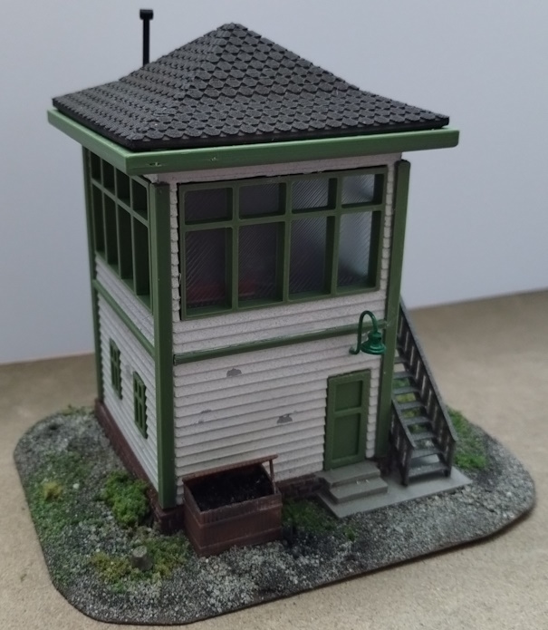 The upper floor has some details, including two desks - one with a phone, typewriter, and thermos, while the other has a collection of papers over the top. A potbelly stove and pipe are in the back-left corner. A figure will be added standing at the desk looking out the window, and another will be added climbing the stairs.
I cut a piece of Masonite about twice the size of the foundation and used a stationary belt sander to thin the edges and remove the square shape. I drilled a hole for the wires to pass through and then glued the foundation to the board. The board was then painted "dirt brown" and fine dirt was then applied to the wet paint. There's a small tree stump in one corner. Once everything had dried, I sprayed it with alcohol to wet the surface and then sprinkled more dirt and 3 colors of ground foam "grass", following this up with dilute white glue applied with a dropper. Small foliage clumps were added and secured the same way, with more grass sprinkled over the foliage clumps to give it some color variation.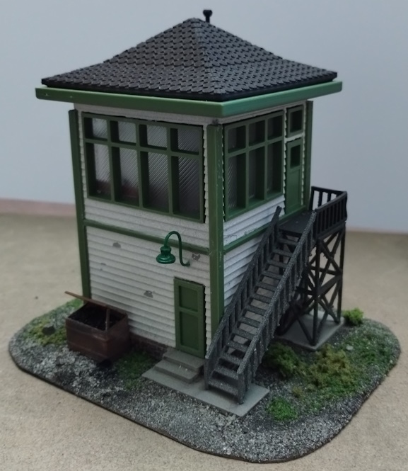
Since we have a coal stove, we needed a coal bin. I created one by defining individual 2x6 boards in the slicer. These were affixed to a box that defined the overall shape, just inside the actual boards. I sprinkled ground glass into the top of the bin and after shaping it into an appropriate "pile of coal" I added a drop of CA. This was then given a coat of thinned gloss black paint and then a brown wash. I printed an extra "board" and used it to prop open the lid. I printed a coal scuttle and glued it to the ground next to the bin, laying on its side. I painted a few fine grains of sand with gloss black and then glued them in and around the scuttle, making it look like it was dropped in haste.
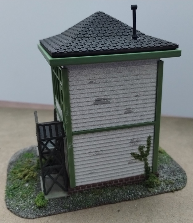 There are a few more details to be added. A red bucket filled with sand will be placed in the open space between the stairs. This will be the "butts bucket" for putting out smokes while sitting on the stairs. A small barrel of spikes and some tie plates will be tossed behind the tower, providing a source of spare parts. Once placed on the layout, the base will be blended into the scenery and then an overspray of browns and blacks from an airbrush will tie everything together. Wires from the nearby pole will come to a junction box mounted on a steel pole, with the wires then heading to the building, since the tower needs both electric and telephone/telegraph connections.
Summary
By working with a freely available set of STLs, I was able to create a unique model to fit a specific space and need on my layout. This really showcases the flexibility of using a 3D printer as a modeling tool.